


In the energy storage and renewable energy industry, your product catalog is often the first document a buyer sees before contacting your sales team. A well-designed catalog doesn’t just list products—it communicates credibility, professionalism, and technical expertise.
Whether you’re presenting battery energy storage systems (BESS), solar inverters, hybrid systems, or turnkey EPC solutions, your catalog design has a direct impact on how buyers perceive your brand.
Let’s explore how to create a professional, high-conversion catalog that impresses technical buyers and procurement teams worldwide.
1. Understand the Buyer’s Reading Behavior
Before diving into layout details, remember that your audience includes:
- Procurement engineers — looking for specifications and compatibility.
- Project developers — focusing on delivery, scalability, and certifications.
- Distributors or integrators — comparing your catalog with competitors.
These readers are busy. They skim first, then read selectively. So your layout should:
- Highlight key specs at a glance.
- Use consistent visual structure.
- Balance visual impact with technical clarity.
2. Define the Structure Before the Design
A strong catalog always follows a clear, predictable flow. For example:
- Cover Page — clean, minimalist, brand-focused.
- Company Introduction — who you are, markets served, production capacity.
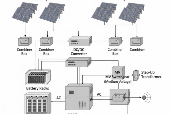
- Core Product Categories — e.g.
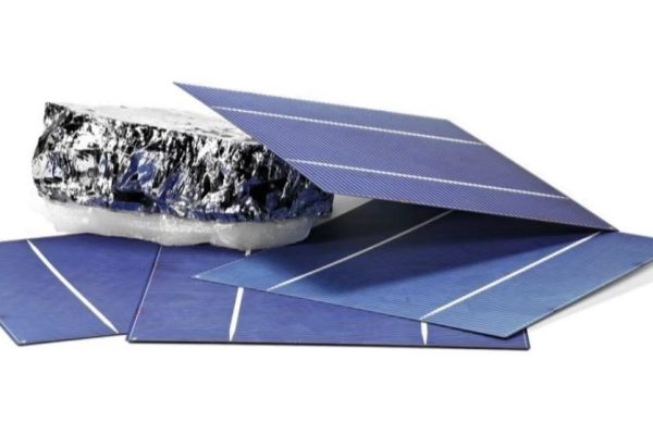
- Residential Energy Storage Systems (5–30 kWh)
- Commercial & Industrial BESS (50–5000 kWh)
- PV + Storage Hybrid Systems
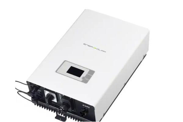
- Inverters, EMS, and Accessories
- Technical Data Sheets
- Project References / Case Studies
- Certifications and Quality Assurance
- Contact Page — with QR code, website, and sales email.
This structure helps international buyers find what they need within seconds.
3. Use a Modular Page Layout
Each product page should have a consistent design grid:
- Left or top: Product image or installation photo.
- Center: Key features (3–6 bullet points).
- Bottom or side: Technical specifications in a clean table.
Example layout for a 10kWh Wall-Mount Battery Module:
| Section | Content |
|---|---|
| Header | Product name, model number |
| Image Area | Clean white background, 3D render or real installation photo |
| Key Features | Compact design, high cycle life, easy wall mount, IP65 rating |
| Technical Data Table | Capacity, voltage range, cycle life, communication protocol, certifications |
| Footer | Icons of CE, UN38.3, IEC62619, ISO9001 |
Keep spacing balanced. Avoid crowding too many specs into one page—buyers value clarity more than density.
4. Visual Design: Clean, Consistent, and Industry-Relevant
✅ Colors
Use colors that reflect technology, trust, and energy:
- Main tones: Deep blue, grey, and white (professional and technical)
- Accent tones: Green (renewable), yellow (energy), or orange (innovation)
Avoid overly bright or saturated colors that reduce readability.
✅ Typography
- Use a sans-serif font for English text (e.g., Helvetica, Lato, Roboto).
- Keep body text at 10–11pt, and titles at 16–20pt.
- Maintain consistent spacing and hierarchy.
✅ Icons and Visual Elements
Use clean line icons for features like:
- ⚡ High efficiency
- 🔋 Long cycle life
- 🌍 Eco-friendly
- 🔧 Easy installation
Icons quickly communicate technical points to international buyers.
5. Showcase Real Projects and Clients
One of the most powerful catalog sections is “Project References”. Buyers want to see real installations and real performance. Include:
- Location and capacity (e.g., “10MWh C&I BESS in Germany”)
- Photo of site or equipment in operation
- Short 2–3 line project description (timeline, results, partner)
Pro tip: Use global map icons to show your installation regions—it creates a strong visual impression of scale.
6. Keep Technical Data Organized and Comparable
When buyers compare catalogs, they look for clarity. So:
- Align all tables using the same format.
- Include essential specs only (capacity, voltage, cycle life, efficiency, weight).
- Add a note for customization options instead of listing dozens of variants.
Example:
Custom voltage and capacity configurations are available upon request. Contact our technical team for design optimization.
This keeps pages clean and still communicates flexibility.
7. Integrate Brand Personality Subtly
A professional catalog isn’t just about specs—it’s about brand trust.
Show your identity through:
- Consistent use of logo and color scheme.
- Short tagline under your company name (e.g., “Reliable Power. Smart Storage.”).
- A brief “Our Mission” statement focused on innovation, sustainability, and reliability.
Remember: credibility grows from visual consistency and confident tone.
8. Optimize for Digital and Print
Modern catalogs serve both as downloadable PDFs and printed handouts.
Tips:
- Ensure text readability on screens (avoid tiny fonts).
- Use file compression without losing image clarity (target under 15 MB for email).
- Add clickable links and QR codes for:
- Product pages
- Datasheets
- Videos or 3D models
A well-designed digital catalog doubles as a lead-generation tool when shared via LinkedIn or your website.
9. Include Certification and Compliance Sections
Buyers in the BESS industry always check certifications first. Dedicate a section to:
- UL 9540 / UL 1973
- IEC 62619 / IEC 62933
- UN38.3
- ISO9001 / ISO14001 / ISO45001
Use logos and short explanations (e.g., “Compliant with IEC 62619 safety standards for stationary lithium batteries.”)
This builds instant confidence in quality and export readiness.
10. End with a Strong Call to Action (CTA)
Your final page should not be an afterthought. It’s where buyers decide whether to reach out.
Include:
- Company contact info (email, website, WhatsApp, LinkedIn)
- QR codes for brochures or contact forms
- A professional CTA like: “Let’s power your next storage project — contact our sales team for system design and quotation.”
Common Mistakes to Avoid
- ❌ Overloaded pages (too much text or too many products)
- ❌ Inconsistent photo quality or aspect ratios
- ❌ Unclear specification formatting
- ❌ Missing certifications or outdated logos
- ❌ No contact or inquiry information
Your catalog should feel like an engineer’s guidebook, not a flyer.
In the energy storage and renewable energy market, a well-designed catalog does more than display products—it sells confidence, precision, and reliability.
A professional catalog should:
- Be technically structured for engineers
- Be visually elegant for decision-makers
- Be optimized digitally for international buyers
Suppliers who invest in clean, credible catalog design will stand out in trade shows, online outreach, and buyer follow-ups—turning a simple brochure into a powerful sales asset.